

Snapbook
Enhancing the Audiobook Experience
Timeline
February - May 2021
Introduction
In early 2021, motivated by personal frustrations and similar feedback from friends, I embarked on redesigning the Snapbook app. This case study outlines the journey of making audiobooks more accessible, enjoyable, and less distracting for users.
_edited.png)
The Problem
Users often find audiobooks less stimulating and engaging compared to physical books. Challenges include the monotonous narration of complex characters, distractions that lead to missing key details, and the inability to interact deeply with the content.
Goals
-
Improve the audiobook listening experience to increase user engagement and satisfaction.
-
Minimize distractions commonly associated with audiobook listening.
-
Enhance accessibility and interaction options within the app.
Target Audience
This project targets audiobook users aged 18 and above who frequently use smartphones and are familiar with digital reading alternatives.
Research Insights
Through surveys and interviews, I gathered key insights that shaped the redesign:
-
Likes: Users appreciate audiobooks for their convenience and ability to multitask.
-
Frustrations: High production costs lead to pricier options, and the passive listening experience often results in missed content.
User Persona
Developed a detailed persona, Olivia, who represents a typical user facing challenges with current audiobook platforms.
.webp)
Empathy Map
Created an empathy map to better understand Olivia’s emotional and cognitive experiences during her audiobook interactions.
.webp)
User Journey Map
Outlined Olivia’s typical interaction with the app, from discovering new books to listening and managing settings.
%20(1).webp)
Planning and Design Process
Sketches
Started with hand-drawn sketches to quickly explore various design concepts that address user pain points.
.webp)
%20(1).webp)
To create the desired user experience for Snapbook, I chose Purple Pink as the primary color to evoke feelings of intuition, vision, and observation. Additionally, the color signifies the app's emphasis on creativity and wisdom in its products. For typography, I opted for two typefaces, Inter and Ubuntu, to achieve a simple, modern, and clean appearance that complements the overall look and feel of the app.

Usability Testing
Conducted extensive usability tests to refine the design, receiving valuable feedback on various aspects:
-
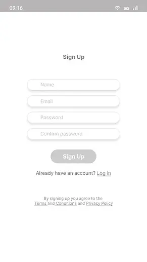
Feedback #1: Users requested more sign-in options, including social media integrations.
-
Feedback #2: Suggested adding notification reminders for scheduled reading sessions.
.webp)
Low Fidelity Wireframes
Translated sketches into digital wireframes using Figma, focusing on improving navigation and interactive elements.


High Fidelity Wireframes
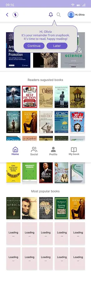
Developed high-fidelity wireframes that incorporate the app’s visual identity and enhanced usability features.


Branding and Visual Design
Selected a color scheme of Blue and Purple Pink, symbolizing reliability and creativity, which are crucial for the immersive Snapbook experience. The chosen typography, Inter and Ubuntu, complements the app’s modern and user-friendly interface.
.webp)
Key Takeaways
-
Enhancing user interaction with content can significantly boost engagement.
-
Addressing user feedback promptly leads to a more tailored and satisfying user experience.
Conclusion and Next Steps
The redesign of Snapbook has demonstrated a positive impact on user engagement and satisfaction. Ongoing testing and iterations will continue to refine and adapt the app to meet emerging user needs.
Connect
More projects


